Typeface: to serif or not to serif
If you are starting your website or blog then one of the most important, and perhaps one of the easiest, is which kind of typeface you choose: with serif or without serif (sans-serif).

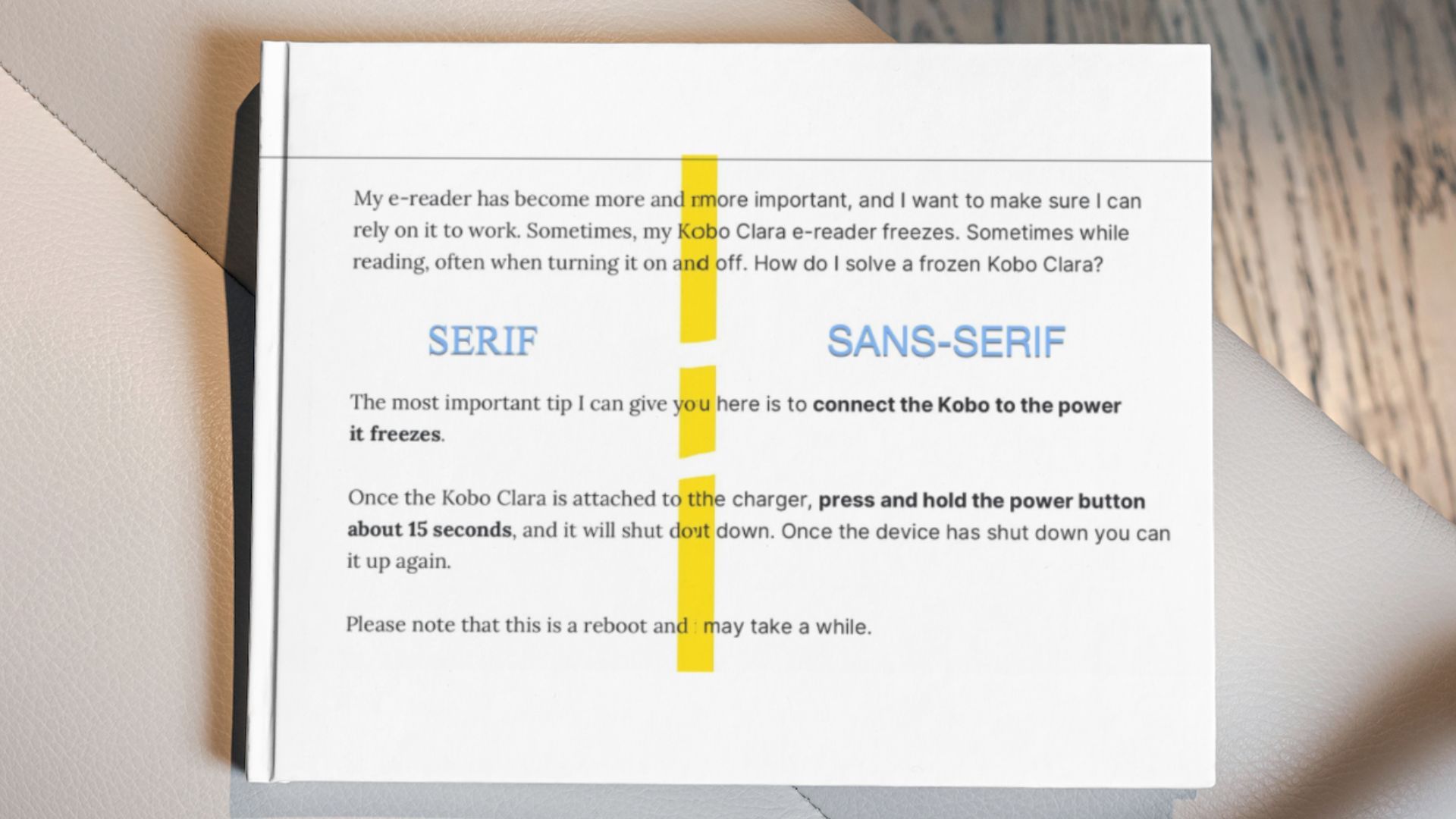
A serif is an old word for stroke. Letters can have these serifs, and this is a relic from when they were carved into stone. People would first make the serifs and then fill in the letters. It was safer without an eraser.
Text should be treated as an integral work of (visual) art.
But a serif is also, as a stroke, part of some more modern fonts. The serifs. Very crudely said, if you strip a letter of all these strokes, you get a sans-serif.
Knowledge about sans-serifs applied
In my blog's template, created in Ghost, you can switch the letters of the texts between a serif and a sans-serif. And that's precisely what I've done now. From a more classic serif to a more modern and minimal sans-serif. In the case of blog, it is the Inter by Rasmus Andersson.
Everything looks smoother, more businesslike and more readable. I am very happy with it. It's a matter of appearance, a choice, but also a necessary choice. I find the sans-serif to be really more readable on the smaller screens that work with light.
And to stick up for the serif as well, it looks more classic, chic and a bit more human. Less minimal. The serif works fine on paper and fine on e-reader.
Typeface is the shared design of a set of letters, numbers and symbols. Like Helvetica, Roboto or Times New Roman.
A typeface typically has different fonts. For instance, Helvetica 12 points light and Helvetica 14 points bold are different fonts, but the same typeface.
Easy choice
I could not find conclusive scientific proof for the readability claim, so you will have to make the choice with your intuition. But once you see it, then you can't miss it.
Now I am happy with the new font, I hope you as a reader like it better too. I wondered why I didn't do switch over to Sans-serif much earlier, but I didn't really know the difference very well.
With this article, I have tried to clarify and simplify choosing the right font, but there will always be an element of taste between serif or sans-serif. And something of a fashionable interpretation. But in most cases, for display on a screen, I would go with a sans-serif typeface.
When choosing typefaces, there are two key considerations: how does this type make us feel and how does this type work? The emotional response to the shape of letterforms is a very personal experience, and when readers first see type, they react to it in an emotional way before anything else. It's a major part of why so much emphasis is placed on choosing type even when it's not technically a part of typography. Google Fonts.
Read more: Typography insights and Monospaced fonts