Monospaced fonts: From Typewriter to the Matrix
Follow the white rabbit down the hole. From Stephen King's memoir of the craft to computer coding and the Matrix film. A short article on single-spaced-fonts.
I was reading Stephen King’s book on writing, and in this fantastic book he writes about single-spaced fonts a couple of times. He talks about these fonts as a clear measurement for productivity, and I started wondering what those single space fonts are.
Although no copies of that particular masterpiece survive (at least to my knowledge), I believe it was eight pages long, each page single-spaced and paragraph breaks kept to an absolute minimum (each stencil cost nineteen cents, remember). Stephen King, On Writing: A Memoir of the Craft
Monospaced fonts
Turns out that he is from an era where the type machine was the norm when writing. These mechanical machines use the energy of the button press to stamp a letter or symbol. You push a button and an iron cast of the letter flies to the paper. Just before impact a lint with ink is pushed between the letter and the paper, TIK, the letter appears on the paper.
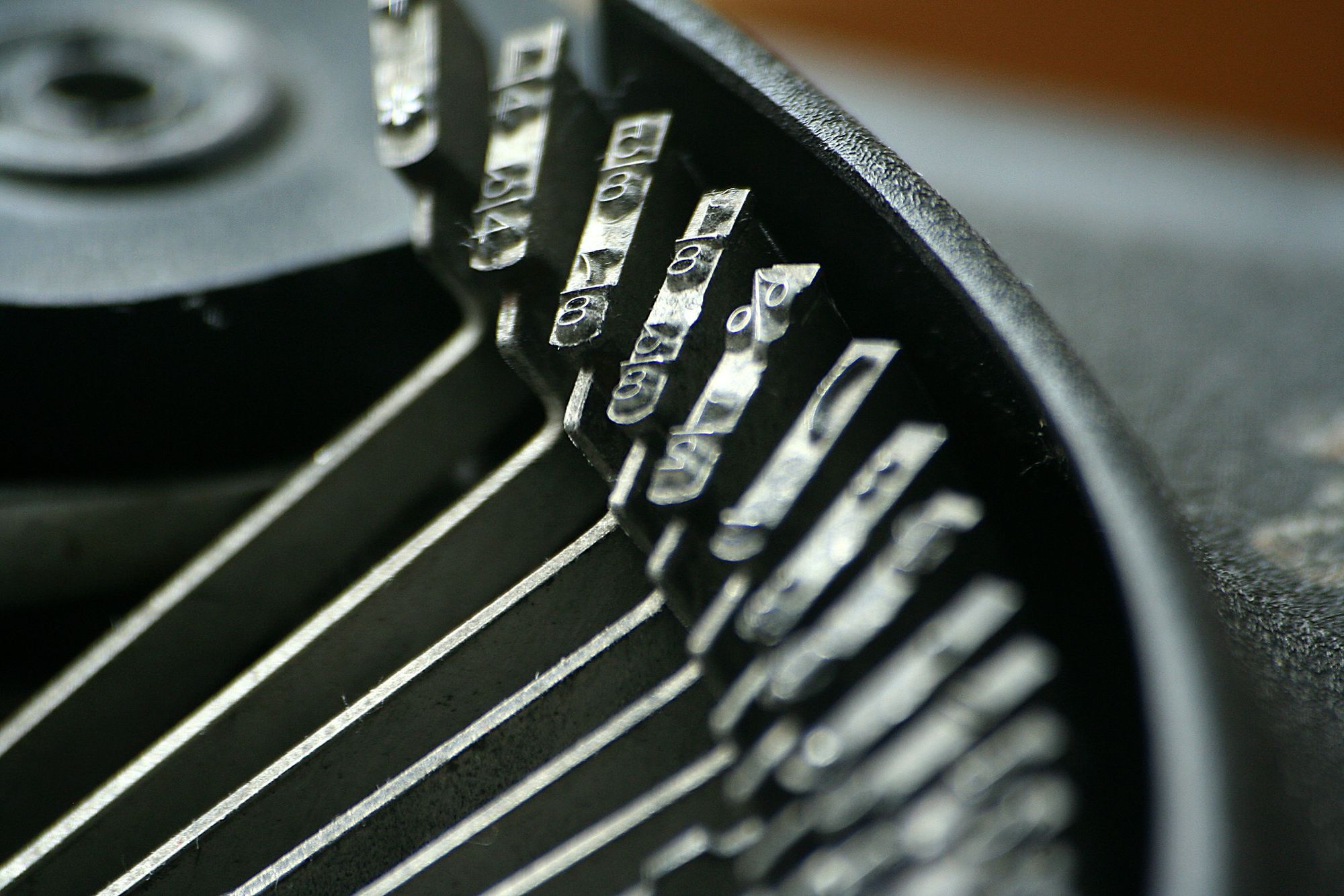
All these letters and symbols use up the same width. And so does a space or for instance a small glyph like a dot or a comma. All the letters, word, lines line up on a matrix. So now you can count how much characters go on a sheet of paper. It is an analogue form of count. Not very precise per sheet, but it probably evens out pretty good when there’s a stack of paper. So if you are writing a novel or a script, you can estimate the number of pages you need to aim for.
The fonts used for this are referred to as single space fonts or monospaced fonts. There are multiple types and sizes that go with the typewriter. Most used is the Courier.

Early computer font
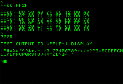
When I was reading about the typewriter and its fonts, it suddenly occurred to me that in the early computing days the same sort of approach was taken. On the mono coloured screen, there was a so-called cursor blinking. An indication where text would appear when you typed. That cursor showed up as a little stripe or rectangular block. Always the same width. The font used was also monospaced, as with the typewriter. It filled a matrix. And so, for a long time, it also appeared on the paper when printed.
Programmers still often write computer code with editors that use a monospaced font like Courier. I'm not sure why that is, maybe out of tradition. Or maybe because the number of letters or lines give an estimate of file sizes. These editing programs easily could display disproportional fonts like the ones you are reading this article with.
Both screenplays and stage play scripts frequently use monospaced fonts, to make it easier to judge the time a script will last for from the number of pages. The industry standard is 12 point Courier. A tradition holds that on this format one page of script will take one minute of screen or stage time.
Wikipedia, Monospaced font
Matrix, the green letter tears
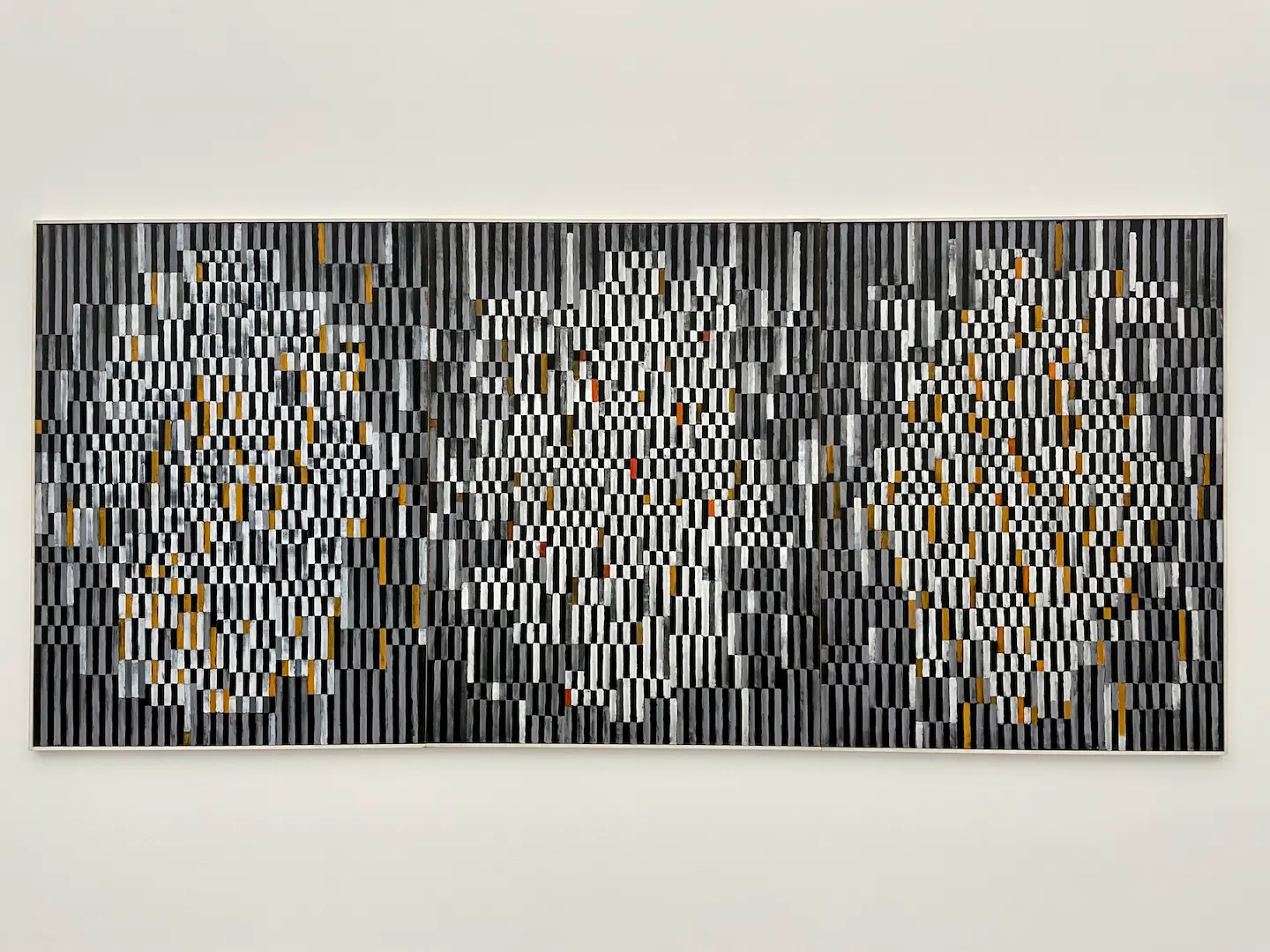
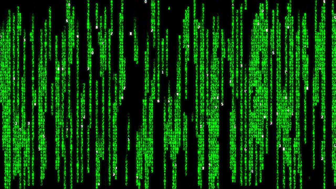
The word matrix now is associated easily with the film, and then it struck me that the iconic green cyphers they use are monospaced and that is the reason they can droop down so nicely in green lines. The letters of the matrix are all on a matrix. A digital rain.
The single-spaced fonts from Stephen King’s typewriter took me to the early computer fonts. These fonts are placed on an invisible matrix, and the film graphics uses this matrix to show the patterns.
Read more: Typeface: to serif or not to serif and Typography insights