Shoot in both Portrait and Landscape
Tips for producing your own images for a webpage with social media campaign. In short: shoot landscape and portrait.
A short post about what I have learned about images that need to fill multiple sizes and slots. I will show you by a personal example:
I'm teaching a web copywriting workshop and for this I have a landing page with social image, a checkout page and a campaign on Facebook/Instagram. Of course I will also want to share my landing page on Twitter and LinkedIn.
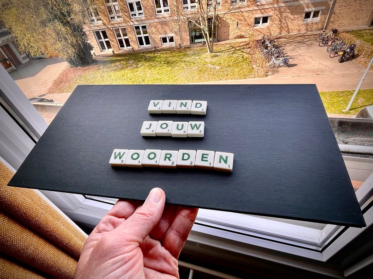
Find the words
The workshop is about how - once you have a strategy, plan and schedule - you can overcome your fear of the blank page. So, I take the people with me through keywords gathering, copy writer briefing, and a series of very tangible and concrete tips.
And that message of finding the words needed to include an image. You want to stand out but also have it functionally fit with the subject. I quickly made a pre-selection and ended up with the Scrabble letters. This is a strong idea because we need to find words. Unfortunately, the image was in English, so I decided to do produce on myself.
Creating my own pictures
I looked for a scrabble board, came up with a text, set the lighting and took a photo with the iPhone. What I learned soon after, especially since there was text on it, is to take landscape and portrait shots with plenty of room to crop. To be able to crop to a suitable ratio between height and width. Let me show you why.
Formats
The campaign is running on Facebook and Instagram, in the news feed and stories. The images there are generally standing or square:

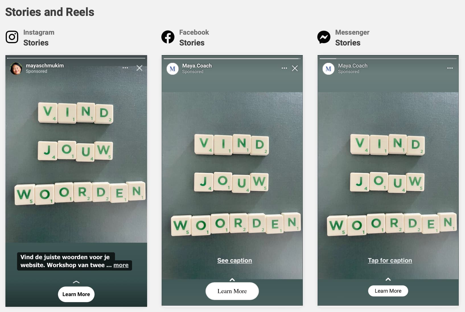
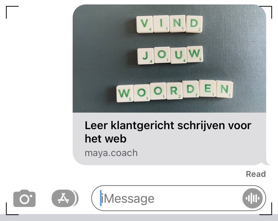
Then there's the landing page of the workshop and there I can choose, landscape or portrait:
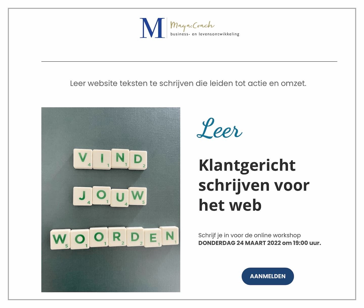
Open Graph image
But the accompanying social media image for the landing page, Open Graph Image, is again landscape oriented with a different aspect ratio than the iPhone standard (4:3). I made that image landscape and then cropped it back to 16:9. Otherwise, the letters are partly out of the picture. Now they look really nice and readable when the page is shared:
Lessons learned
In conclusion, the ability to shoot images in both portrait and landscape formats is an indispensable asset for an online professional. As demonstrated through our exploration of various platforms and their distinct image requirements, the versatility of having both formats at your disposal is paramount. Whether it's Facebook and Instagram, your workshop's landing page, or Open Graph images, the adaptability of your visuals across different contexts can significantly impact the success of your campaigns. Remember to leave room for cropping and adjustments to ensure your images shine in every setting.
As you navigate the ever-evolving landscape of online marketing and content creation, keep in mind that it's not just about finding the right words but also selecting the right image formats. These seemingly subtle choices can wield immense influence over how your message resonates with your audience and spreads throughout the digital realm.
So, embrace the power of versatility in image formats, and let it be your ally in crafting compelling, shareable content that makes a lasting impression.